HarbourStone — Marketing Materials

Every asset here comes off the same brand system. The value was in the repeatability: once the templates existed, a new agent card or a new flyer took hours rather than a redesign.
One card, six agents
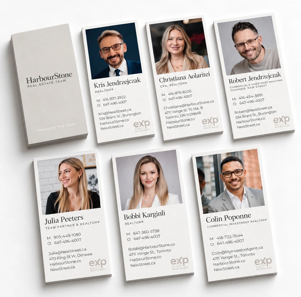
Seven cards off one template. A greige reverse carries the team wordmark and the brokerage credit; the front is built to be re-skinned per agent, so a new headshot, name, title, phone and address drop into the same fixed layout without anyone opening the file.
That is the whole value of the piece. Six agents each needed a card, and treating that as six pieces of design would have cost six times as much. Treating it as one template cost once — so onboarding the next agent is a fill-in, not a redesign.
Signage that reads from the sidewalk
Both signs are the same templates, staged on real frontages: the For Sale board hung from a post in a garden, the Open House board standing on the path. Each one puts its headline at reading distance and carries a cut-out photograph of the agent, with the contact block and the R/MLS and brokerage logos along the foot. Staged like this, the test is not whether the artwork looks right on a screen but whether it still reads from a parked car, in daylight, against real architecture — and whether the arrow on the Open House board is pointing anyone the right way before they get out.
The HarbourStone Journal
A monthly email to the team's database, built on the same brand banner and titled as an edition so each month is recognisably part of one publication. The copy takes a position rather than summarising the market: what has changed, which listings are worth a second look, and the reasoning behind the numbers. The template does the layout once, so the recurring cost is writing rather than design.
 HarbourStone Real Estate Team<support@harbourstone.co>to me

Post Cards
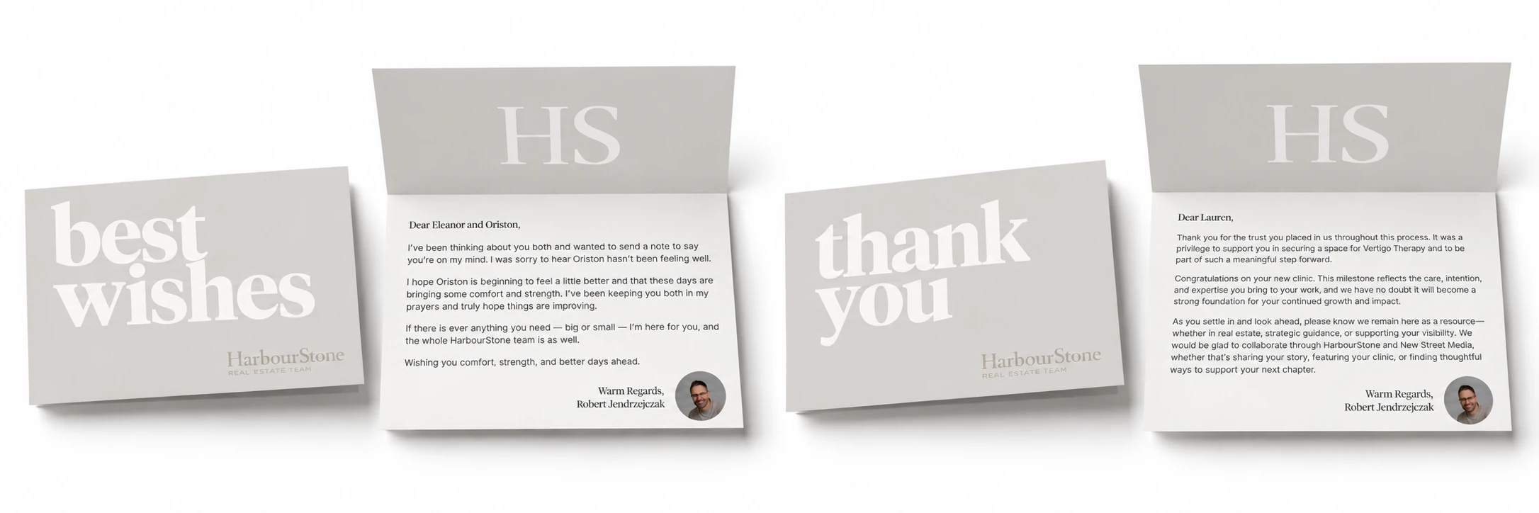
Two cards off the same template, each with a single word set large enough to be read across a table — "best wishes" and "thank you". What is behind them is the part that mattered: a written note on the team's letterhead, signed with a headshot, so a follow-up reads as a person rather than a printout. The oversized serif is deliberate and unguarded. A word this large cannot fit any longer sentence, so the format itself decides how much is said — the cards carry a thought, and the writing inside them carries the actual message.
Prints
One template, run twice with completely different copy — which is the test of whether a template is doing any work. Bobbi's asks a question ("Buying, Selling, or Leasing?") and answers the fear behind it: you need to do one thing, reach out, and she will take care of the other ninety-nine questions. Robert's leads with commercial investment and answers with what a client actually receives for it. Same grid, same wordmark, same contact block with a QR code to save the number. The pieces were photographed side by side in the office window so the pair could be compared as a set, since that is how they are handed over.