HarbourStone — Branding

The Brief
The brief: position HarbourStone as a luxury, advisory-led brand through restraint, not excess — considered and authoritative.
Execution
Luxury came through restraint: an architectural monogram and refined wordmark, a dark-and-cream palette and generous space.
The goal wasn’t to make every asset look identical. It was to make every asset feel unmistakably HarbourStone.
The Wordmark
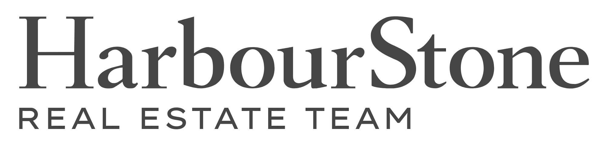
A wordmark that was built, not typed.
I started with a centred typographic lockup, then deliberately broke from it — left-aligned reads more editorial and architectural.
The wordmark itself was drawn by hand in Adobe Illustrator rather than set in a typeface — adjusting letterforms, spacing and proportions until the mark felt distinctly HarbourStone.
The serif brings heritage and authority; the restrained descriptor keeps it contemporary — premium without needing to announce itself.

The Monogram
Designed for the places where the full wordmark can't go.
The HS monogram is the brand's smallest, most recognisable expression — built for avatars and thumbnails, where the full wordmark disappears.
The black-and-grey treatment was chosen for exactly that: strong contrast on both light and dark interfaces, so the mark stays legible in either mode.
The circular container survives aggressive scaling and cropping; the high-contrast letterforms still read when tiny.
The wordmark establishes the brand. The monogram makes it recognisable at a glance.
The Brand Guide
The rules behind the restraint.
This brand guide translates HarbourStone's positioning and “human-first” philosophy into one identity system — wordmark, typography, colour, hierarchy, photography and content.
A visual system built to make HarbourStone feel considered, human and quietly premium across every touchpoint.
Seller Guides
The client-facing guides: a print edition handed out at appointments and open houses, and a digital edition of the same material as a link — both following the brand system above.